Design

Principles of Website Design: Repetition

Beginners Guide to Growth Driven Design
A growth-driven website is always being perfected.
Schedule Free DemoFlashy, brand-new websites can attract a lot of attention, but they’re not the same as a memorable brand, which can be a key driver of qualified leads. This is where the fundamental principle of repetition plays into the overall strategy of your design; doing something new and “exciting” on every page can confuse users and create a disunified brand that no one quite remembers.
This is a part of a four-blog-post series where we explain the fundamental principles of great design: Focus, Alignment, Repetition, and Contrast. Our designers and developers use this principles in combination with the latest best practices for hosting and operating the back end of a website to create gorgeous pages for our clients that not only look good, but also convert leads consistently.
Repetition
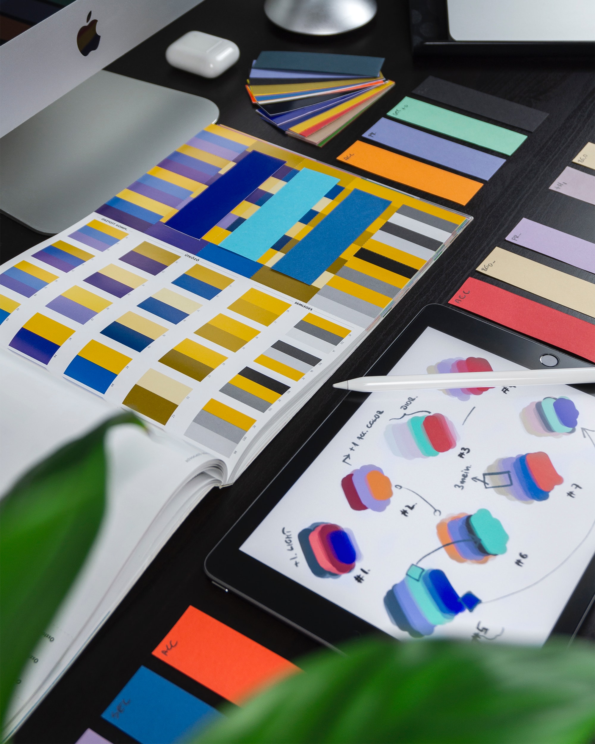
When it comes to branding, every marketer knows it takes multiple impressions of your logo, name, or even color scheme to become memorable to someone who sees it. This is why repetition, done well, is key to a great website design. Repetitive elements, such as accent colors, fonts, and photo placement, helps people remember who you are and what you can offer them.
Best practices for repetition don’t just rely on using the exact same formula every time, as we mentioned in talking about Alignment how asymmetrical balance can be a strategic part of overall consistent alignment. However, it does mean that once you use a font for an important element, such as your logo or website header, you need to use it again in other important places.
It also means keeping page structures predictable, if not interesting. For example, if your main procedures include an introduction paragraph, a bulleted list of benefits, and a call to action at the bottom, people will expect that to carry through all your main procedures. Anything less can limit people’s information at best, or at worst, confuse them to the point of looking elsewhere for expertise on their desired procedure.
Contrast Vs. Repetition
When it comes to design, contrast and repetition are similar to the relationship of yin and yang. They influence each other and create a harmonious tension that can be described as “changing things predictably.” Although you’ll use one or two main colors for your logo and site design, for example, you aren’t limited to where you can use those colors, to a certain degree.
Designers know to use both these principles in moderation, although they are near opposites. But keeping things in “the middle” in this sense doesn’t mean your website will look boring and bland. In fact, the pressures of needing both consistency and contrast can cause great feats of creativity and take your site and brand to the next level.
Professional Website Design By DLM
If you’re a medical practice leader who knows your website is out of date, but aren’t sure how to go about fixing it, our designers and developers can help. We can analyze your site’s performance and draft a design that can be quickly implemented to refresh your brand and link your site to a powerful CRM that allows you to collect and respond to leads via text, email, and phone calls. Learn more about how a new website can help grow your practice by calling our team or contacting us online today.


